
Let’s talk about the unsung hero of web design: the website navigation bar. It’s easy to get caught up in flashy graphics and multimedia, which is great, no one wants an ugly website, but did you know that poor navigation can scare away up to 55% of your visitors? Yep, it’s true! Users want info fast, not a treasure hunt.
Ready to stop the detour of visitors? Dive into my 3 tips to amp up your website navagation right now!
- Who knew navigating the web could be such an adventure? Effective website navigation bar isn’t just about menus and links – it’s about crafting a journey for users! Keep things organized and crystal clear to keep your visitors hooked, boost your SEO game, and unlock those sweet business outcomes. Get ready to turn your website into a user-friendly wonderland that keeps ’em coming back for more!
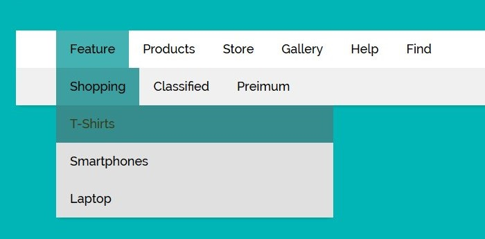
- Let’s talk menus, baby! No, not a food menu. Whether it’s horizontal, vertical, dropdown, or hanging out in the footer, there’s a menu style for every website vibe. Choosing the right one is like picking the perfect outfit – it’s all about what suits your content and how your users like to move around. You also may need more than one! From desktop divas to mobile mavens, you need to keep every client experience in thought while creating stylish navigation!
- Let’s navigate this design maze like pros! Creating user-friendly navigation is all about keeping it simple, staying on brand, and being as responsive! Optimize your user experience and avoid those pesky pitfalls like menu overload. So keep it fresh, keep it fun, and make your website the talk of the town!
You can find even more tips here! Or you can find examples of fun simple websites on our portfolio.
Recent Comments